
About
Kuration Kitchen brings the seasonality of produce into the spotlight.
The retail space bridges seasonal produce and interactive culinary experiences
that encourages users to source, create, and indulge in sustainable goods.
Team
Nasim Lahbichi ~ Designer
Services
Strategy • Visual Design • Concept • Branding • Experiential Design
Skills Used
Hand Sketching • Adobe CC • AutoCAD • Sketchup • VRAY
What is Kuration Kitchen?
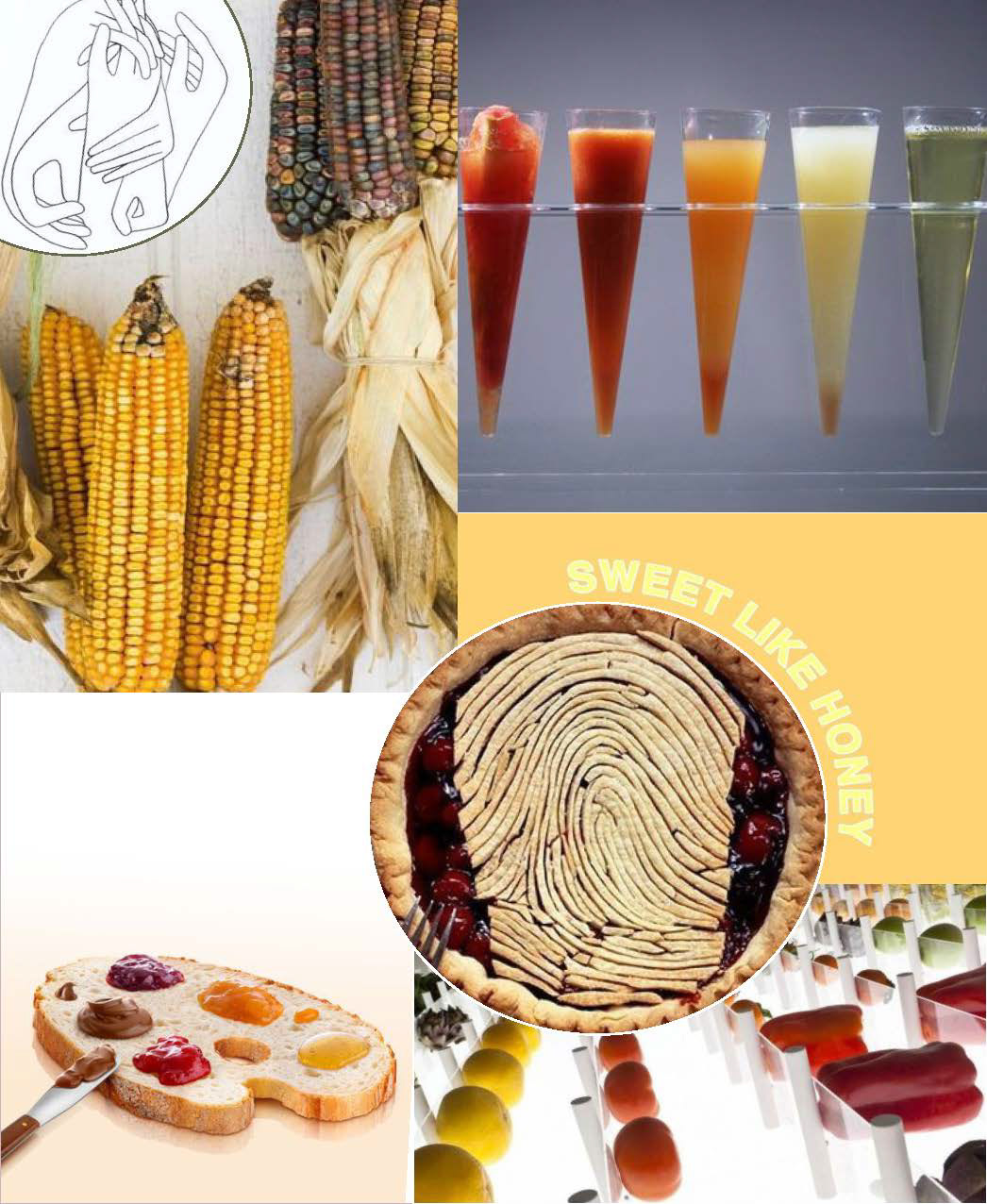
Kuration Kitchen brings the seasonality of produce into the spotlight- letting users pick, create, and indulge in sustainable goods. Partnering with NYC youth and local restaurateurs, the pop-up invites the public to explore the wide array of produce, ingredients, and products curated throughout a season.
The multifunctional space inclusive of a DIY kitchen, farm to table market, and cafe with seasonal offerings will let holistic education and creative expression be the highlight of a customer’s experience.
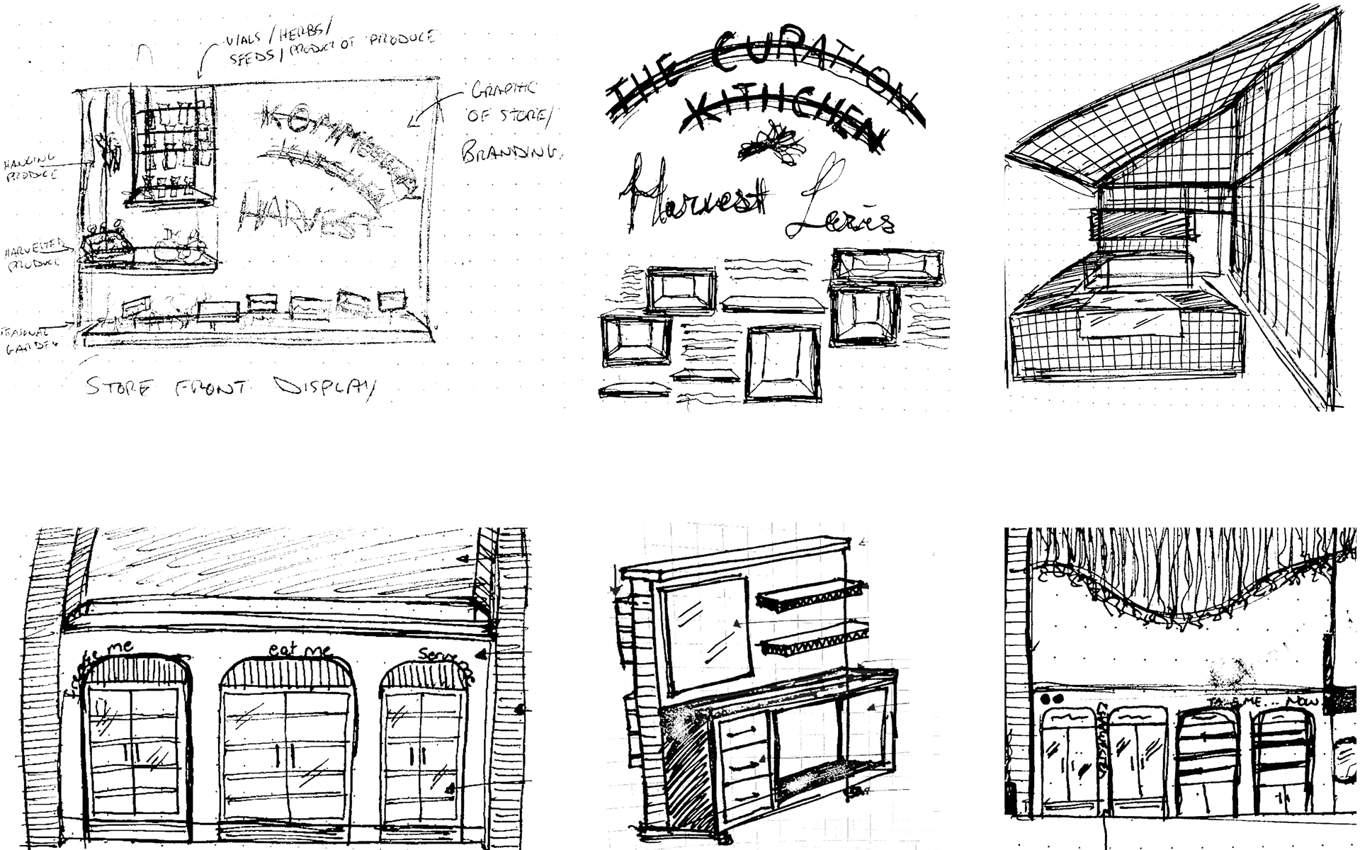
Conceptualization and Brainstorming
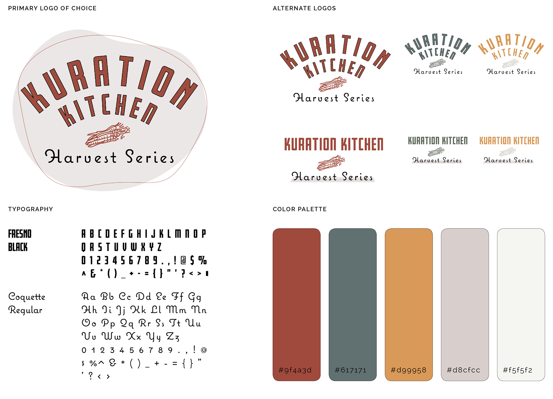
Branding & Visual Identity
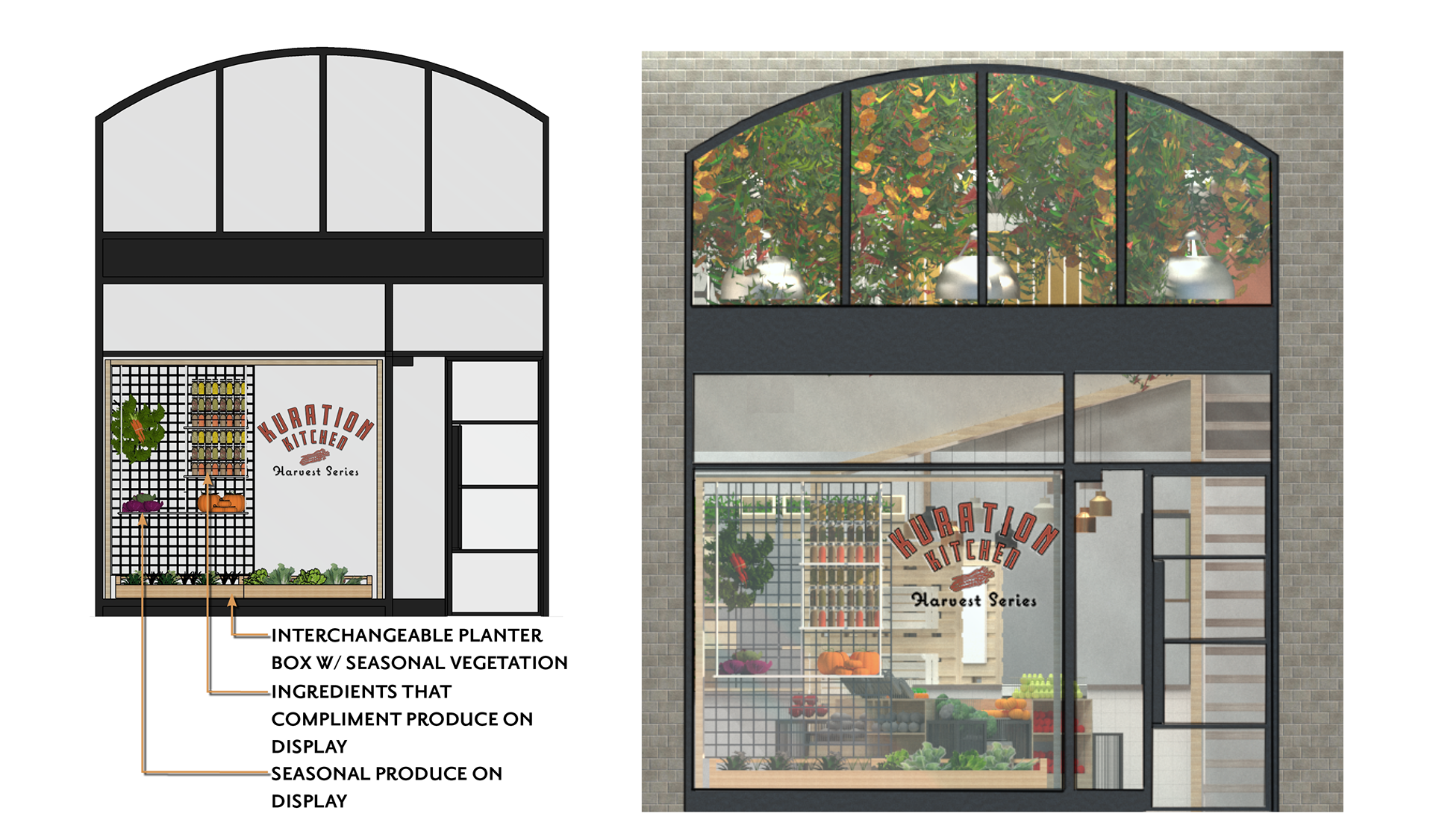
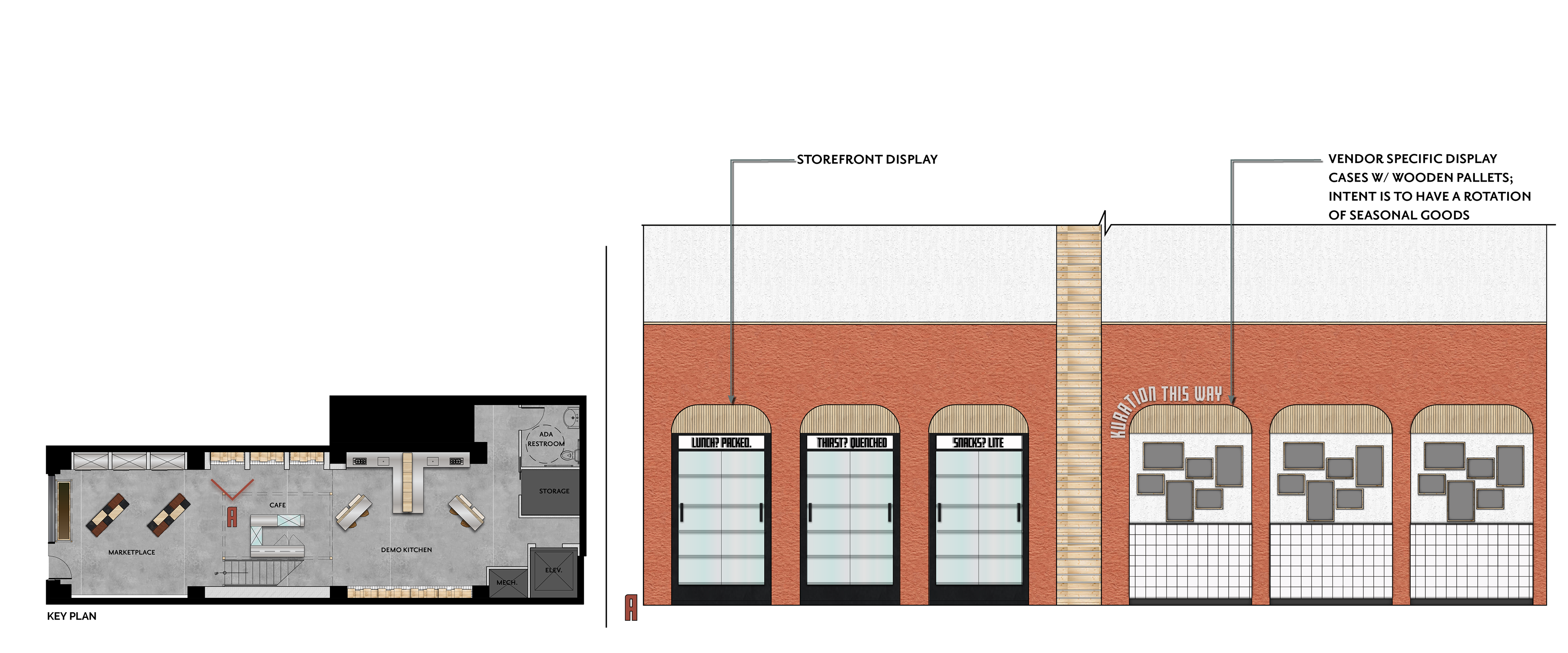
Store Front Window Display
Window displays are tasked with capturing the attention of consumers, defining a store, and begins to express the narrative of a brand. Kuration Kitchen's window display was inspired by the "roots" of seasonal produce, and the processes from vegetation to a completed product. As the season's change, so would the branding, produce, and complimentary ingredients displayed.
Spacial Planning
The user's journey begins when they enter the building and is greeted by the central marketplace. This space markets the wide array of seasonal produce offered during that time of the year. Refrigeration units and vendor displays inserted along the eastern wall aims to showcase various types of products and seasonal goods curated and created by local businesses. The rear of the street level consists of workshop kitchenettes where classes and workshops (open to the public) would be held.
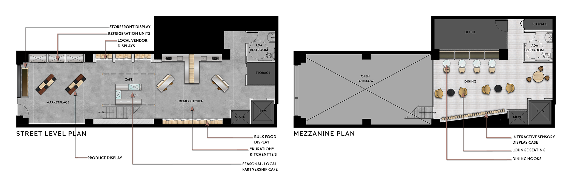
Retail Display
When designing the displays that would house seasonal products curated and created by local vendors, I aimed to keep a similar minimalist aesthetic to highlight the brands being marketed to the consumer. Using simple materials that were light and airy in shape, form and aesthetics allowed for the packaging of these brands to pop against a neutral environment.
Views
